
At Western Sydney Wanderers FC, the brief was to reimagine what consistency could look like for a football club’s season-long outdoor campaign.
Rather than relying on one fixed visual style, the idea was to build a flexible identity system where each match told a different story, cinematic, expressive and visually distinct, yet still unmistakably Wanderers.
The result was a bold outdoor campaign that evolved week by week while holding together as one cohesive season.
Western Sydney Wanderers FC
Western Sydney, NSW
Sport / Football
Sports branding, Outdoor advertising, posters
2019/20 A-League season
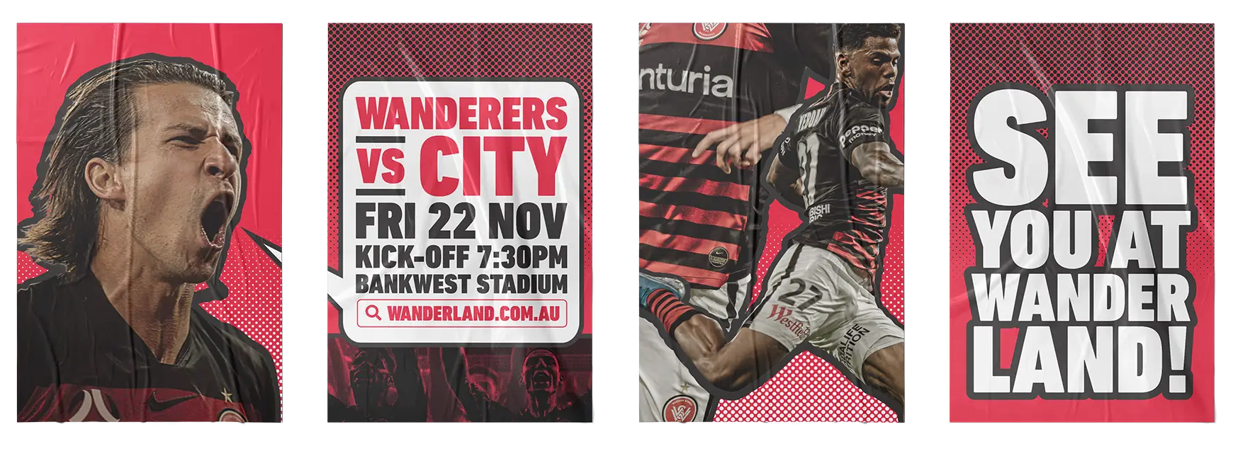
The Wanderers needed a campaign that would reignite fan excitement for their return to Wanderland and keep attention high across the entire 2019/20 A-League season.
Each home match required its own creative energy, designed to stand out across Sydney’s streets and feel relevant to the moment.
The challenge was connecting these individual match campaigns under one recognisable visual language, without flattening creativity or falling into repetition.
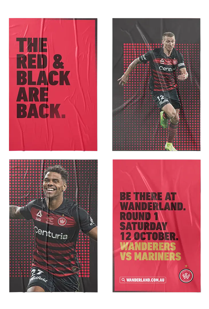
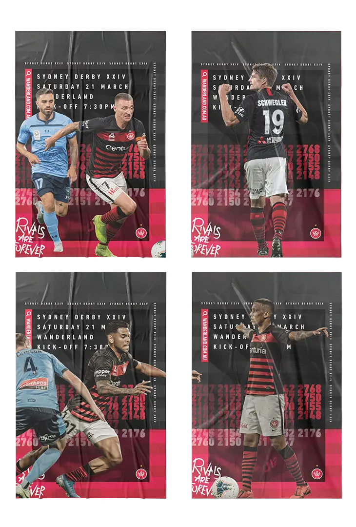
Nat designed a season-long series of outdoor advertising campaigns where typography, tone and colour discipline became the connective tissue.
Each round drew inspiration from a different creative world, while maintaining a shared typographic rhythm and restrained colour palette to create cohesion without conformity.
Key rounds included:
Launch posters celebrating the club’s homecoming and rallying fans for the opening fixture.
Sydney Derby posters inspired by The Shining, creating a bold, unsettling visual tone for the rivalry.
High-energy player posters using bold callouts and graphic illustration techniques.
A typographic, nostalgic approach to ring in the new year.
Structured, minimal compositions designed to reset the season’s visual rhythm.
A supporter-led execution using Western Sydney postcodes and collage design.
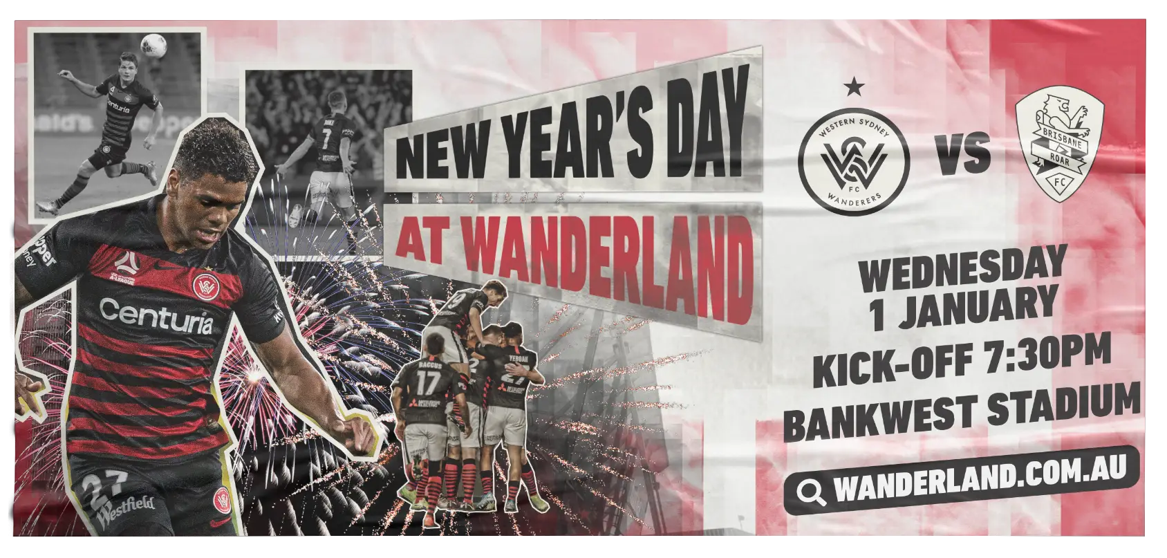
The campaign gave the club a flexible, expressive design system that felt as unpredictable and alive as the season itself.
It broke away from standard football advertising conventions and set a new creative benchmark for how the Wanderers could evolve visually across future seasons, without losing identity or recognition.

Rivals Are Forever.
A season campaign idea that turned match-by-match creative into a bold, recognisable visual system for Western Sydney.