Shaping a long-term creative direction that reflects how football is really experienced.
Nat Gatt Brand Studio developed the creative direction and brand system for the 2026 NPL and Leagues competitions, contributing to immediate year-on-year growth across impressions, engagement and follower growth.
By Round 2, FNSW Leagues impressions had increased by 4,135% and NPL NSW impressions were up 875%, showing the system was embedding across the competition, not simply creating a short spike.
The work created a consistent platform across social, digital, broadcast and editorial outputs, giving internal teams a flexible system they could apply across the full season.
Football NSW
New South Wales
Sports Branding
Creative direction, Visual system design, Content and storytelling framework, Sports brand strategy
2026 Season
The culture was already strong. The challenge was representing it consistently.
NPL and Leagues football already has a strong culture. The challenge wasn’t to invent one.
The issue was representation.
For many fans, players and clubs, the competition no longer begins at the gate. It begins on their phone.
Graphics, photos, video, commentary and headlines needed to feel aligned with the reality of the football being played. Suburban grounds. Rivalries. Ritual. Emotion.
The task was to create a creative direction that felt honest to matchday culture, could be applied consistently across an entire season, and would hold relevance beyond a single year.

We wanted a brand that spoke to the heart of our audience. The players, the fans, the ones that were sharing it on social.

This was not about launching a campaign. It was about setting a direction.
To build a long-term creative platform that would:
A creative platform built around real football culture
Everything was anchored to one idea.
Real Football. Home Grown.
This became the platform for how the competition would be shown, spoken about and experienced.
Home Grown speaks to place. Local grounds. Local clubs. People who have been part of the game for years.
The strategy focused on building meaning through repetition.
The more the idea appears across the season, the more it becomes owned by the people already part of it.
Real Football speaks to feeling. Raw. Emotional. Competitive. Imperfect.
The creative exploration began with texture.
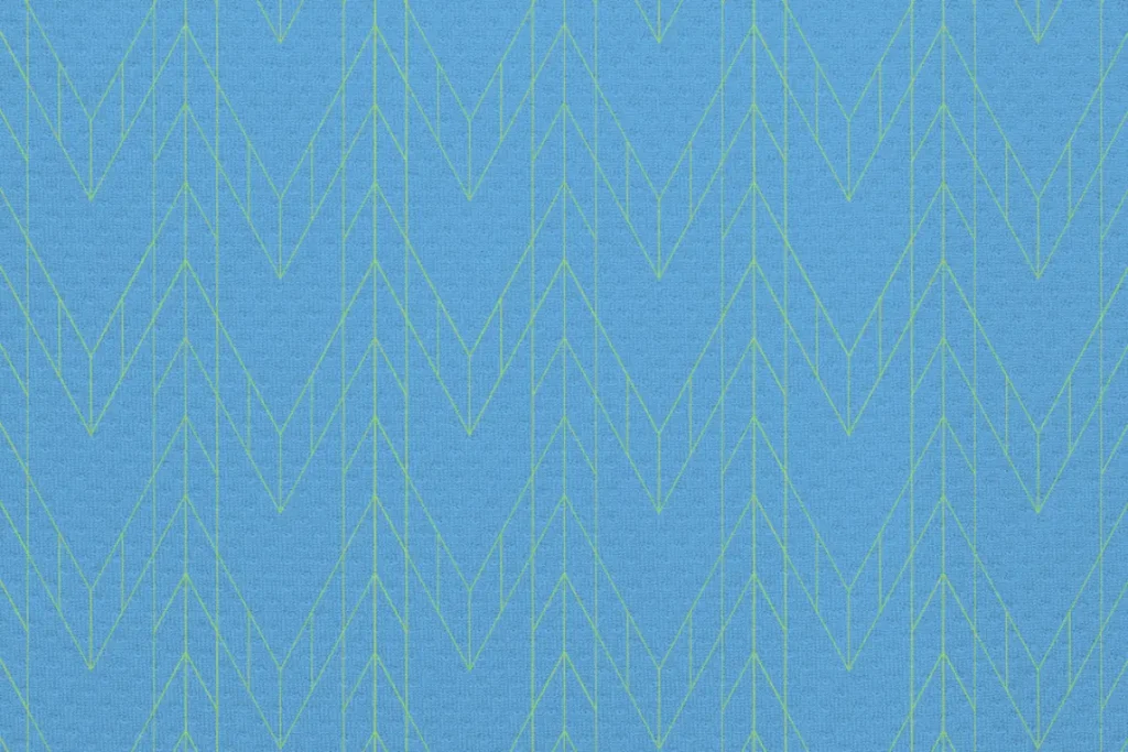


Rather than starting with logos or layouts, the focus was on surfaces and materials that already exist within the game. Fabric patterns, worn ground textures and repeating forms drawn from football kits and matchday environments.
These textures became the foundation of the visual system. They add depth and atmosphere without overpowering the football, allowing graphics to feel grounded, tactile and lived-in.
The intent was to create a visual language that feels familiar to the game, but considered in its execution. Subtle repetition, imperfection and layering give the work energy, while still allowing clarity to lead.

A flexible brand system for a full season rollout
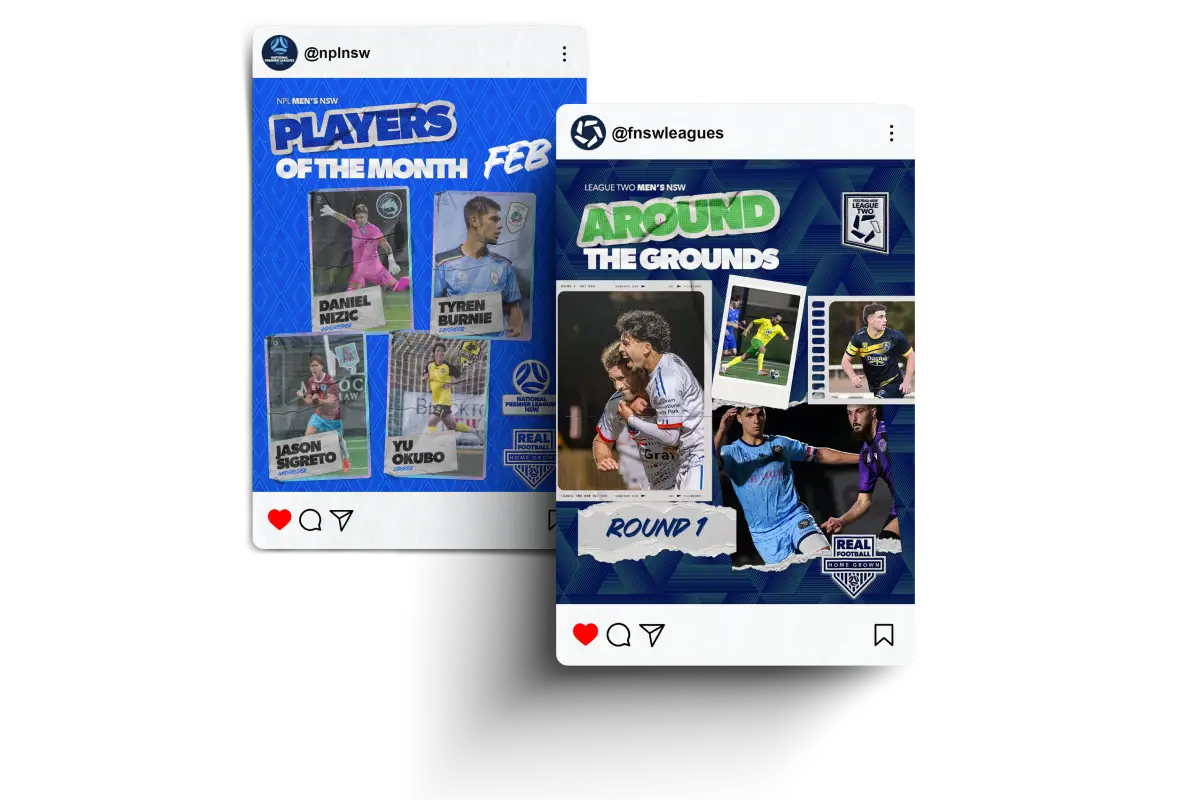
Consistency across every competition touchpoint
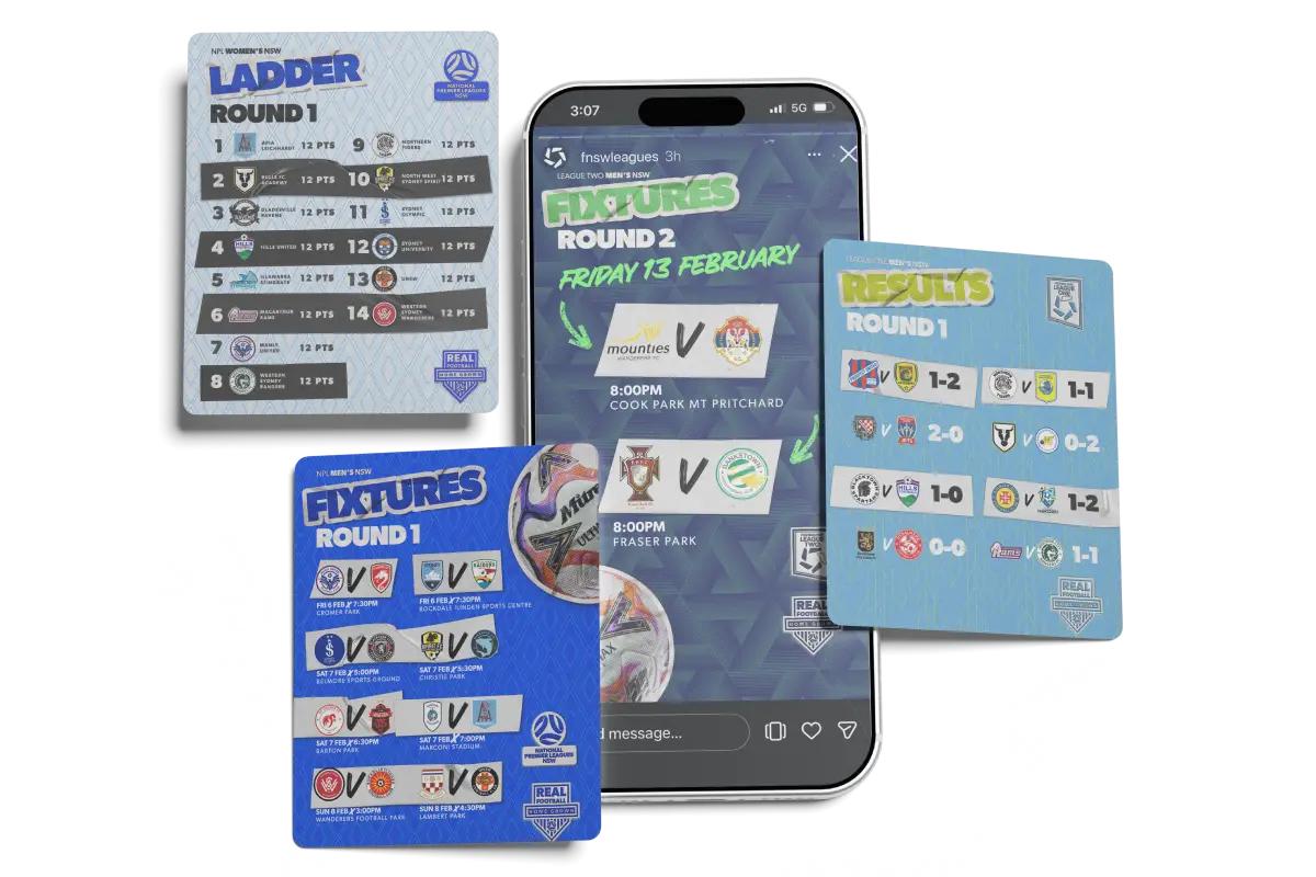
The creative direction is live across all core season touchpoints, including:
Everything lives within the same visual and tonal framework, allowing the season to feel cohesive rather than fragmented.
This created a consistent and recognisable experience across all competition touchpoints, enabling internal teams to produce aligned outputs without reliance on centralised design control.
Immediate growth, sustained across the season
The impact of the new direction was immediate and sustained.
NPL NSW — 131K → 1.35M impressions
NPL NSW — 117K → 814K impressions
NPL NSW — NPL NSW impressions
FNSW Leagues — 17K → 186K impressions
FNSW Leagues — 9K → 295K impressions
FNSW Leagues follower growth
This level of growth indicated the system was embedding across the competition, not spiking.
Engagement metrics, including likes, comments and follower growth, increased significantly year-on-year.
Internally, teams adopted the system quickly, enabling media, content and communications stakeholders to apply the framework consistently across outputs.
Nat’s understanding of our audience, clubs and players was impressive. The framework was well received internally and engagement increased significantly.
Helen Armson
Group Head of Strategic Partnerships and Corporate Affairs, Football NSW