
Visual identity is usually the first thing people jump to. Understandable, it’s the part you can see. A new logo feels like progress. A refreshed colour palette feels like momentum.
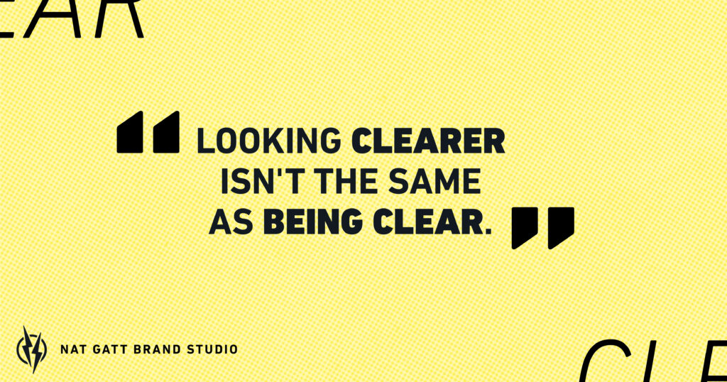
But a sharp-looking brand that doesn’t follow the thinking behind it is just a nicer version of the same problem. Looking clearer isn’t the same as being clear.
Enjoyed this?
Why cohesion is the real issue
What usually goes wrong isn’t bad design. It’s a lack of cohesion. Different people handle different channels, website, social, print, and each one makes their own call on fonts, colours, layout. Add in the documents people put together themselves, proposals, internal decks, email signatures, and inconsistency compounds fast. A customer who gets a proposal that looks nothing like your website is already, on some level, unsure what they’re dealing with. They probably couldn’t tell you why. They’d just feel confused.
Why the order matters
Visual identity works best when it follows everything else: your purpose, your positioning, who you’re actually talking to. A logo built before any of that is settled is really just a guess dressed up nicely. It might look good. It won’t necessarily look like you, because “you” hadn’t been defined yet.
That’s not a knock on doing things yourself early on, when budget’s tight. That’s often the right call. But once the thinking is in place, that’s the moment worth investing properly in a visual identity that actually matches it.

Look at your last five customer touchpoints, website, invoice, socials, packaging, email signature. Do they all look like they belong to the same business? Often they don’t. Usually nobody’s noticed, until you actually go looking.
Want to know where your own brand actually stands? Get you Brand Soundcheck booked in today.