Building a kids’ club brand that connects community, family and football.
Junior Herd is Macarthur FC’s brand for its youngest supporters, created to build early connection through membership, match day moments and family-focused fan experiences.
The refreshed identity helped create a clearer and more exciting membership experience, contributing to early growth in the first week of launch and almost 20% membership growth across the season.
The brand now feels more ownable for Macarthur FC, more engaging for kids and more trusted by parents and local clubs.
Client
Macarthur FC
Location
Macarthur, NSW
Industry
Sport / Football
Scope
Sports Branding, Brand strategy, Brand identity, Creative direction

We needed a brand that felt fun, accessible, and authentic, one that could speak to kids and parents alike.

A kids’ membership program needed stronger connection with families and young fans
Junior Herd began as a free and paid membership program for young fans, but sign-ups were low. The club needed a clearer value proposition and stronger emotional connection with grassroots players and their families.
Our goal was to reposition Junior Herd as a community-first brand that felt fun, local and authentic, one that kids could love and parents could trust.
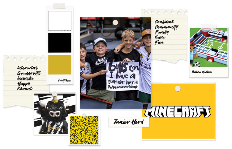

A family-first identity built to grow connection and participation
To build a vibrant, family-first identity that would:
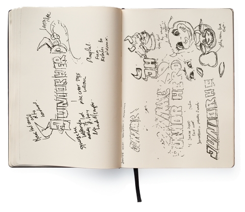
Fun, local and full of community spirit
We began with a brand strategy workshop with the Macarthur FC team to unpack audience insights, values and ambitions.
The vision was fun, local and full of community spirit, never forced or corporate. Inspired by Minecraft and LEGO, we used a modular creative approach built around the club’s mascot, Arthur the Bull.
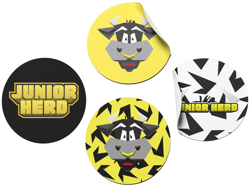
A playful system built around energy and accessibility
The creative phase focused on energy and accessibility.
We explored modular, block-style layouts and playful mascots to make the brand feel alive. Arthur the Bull became the hero of the system, connecting kids across age groups.
The brand needed to feel inclusive, fun and unapologetically local.
A bold, chunky identity kids could connect with
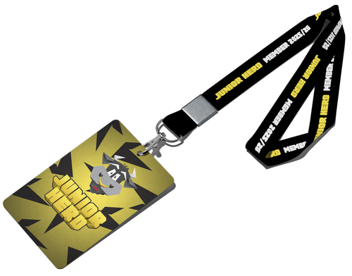
The logo was designed to be bold, chunky and kid-aligned. Arthur’s horns became a flexible design motif used across merchandise and patterns.
A bright, modular system was built around Macarthur FC’s core palette, with an amplified yellow added to inject energy and joy.
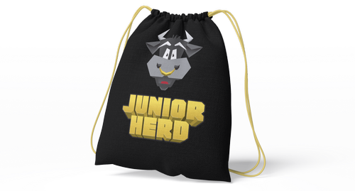
Built for match day, membership packs and everyday fan connection
Almost 20% membership growth after launch
Natalie delivered exceptional work redesigning our Junior Herd brand for Macarthur Bulls FC. She led the team through quantitative and qualitative research to understand our audience and positioning, then brought everything to life with a revitalised brand and comprehensive suite of assets. The rebrand was positively received by our fan base and gave us a fresh, exciting perspective on our Junior Herd brand positioning. Natalie was excellent to work with. Fast, efficient, and thoughtful throughout the entire project. Highly recommended.
Mark Jensen
Chief Commercial Officer, Macarthur FC