Creating a brand identity that captures energy, trust and the ripple effect of great events.
Raw Impact Events needed a brand identity that captured the energy of live events while showing the calm organisation behind the scenes.
The final identity positioned the business as both creative and dependable, giving clients confidence that their events would be handled with precision and care.
Built around the idea of the ripple effect, the system balanced movement, impact and professionalism.
Client
Raw Impact Events
Industry
Events and Event Management
Scope
Brand strategy, brand identity, creative direction

We wanted a brand that reflected the energy of our events while still showing the calm organisation behind the scenes.

A brand identity that builds trust from the first interaction
To create a brand identity that communicates professionalism and reliability from the very first interaction, while still capturing the excitement and energy of live events.
The brand also needed to reflect Abbie’s calm, confident and hands-on leadership style, reinforcing the sense of trust clients feel when handing over responsibility for complex events.
Finally, the identity system needed to be flexible and scalable, working seamlessly across proposals, digital platforms and event environments while positioning Raw Impact Events as both creative and operationally strong.
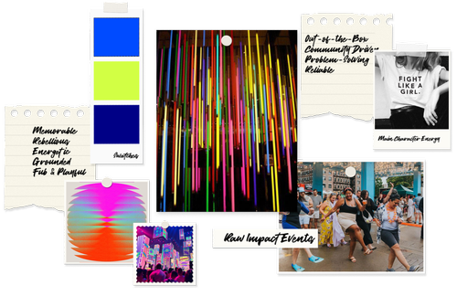
The best events feel effortless, even when the planning is complex



Turning the ripple effect into a visual foundation
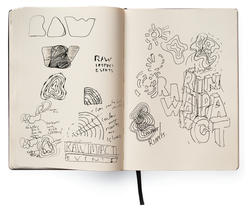
The ripple effect became the visual foundation of the identity.
Exploration focused on forms that could represent movement, expansion and influence without feeling chaotic.
Concentric circular lines became the core motif, symbolising how impact spreads outward from a single moment.
At the same time, the outer form introduces a more organic shape, reflecting the raw and human energy of live events.
A distinctive identity built around movement, impact and control
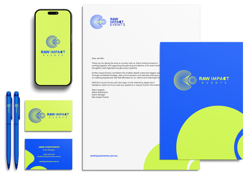
The final logo translates the ripple concept into a distinctive visual mark.
The concentric forms represent reach, influence and expanding impact, while the organic outer shape introduces movement and energy.
The ripple motif is also integrated into the wordmark as the “C” in Impact, linking the icon and typography together to create a cohesive identity.
A brand identity that feels energetic, capable and in control
The final identity captures the essence of Raw Impact Events: high-energy experiences delivered with strong organisation and calm control.
The brand positions Raw Impact Events as both creative and dependable, giving clients confidence that their events will be handled with precision and care.
Natalie is amazing at her craft, she has an ability to bring out your desire and visions for your business that you didn't even know existed! Her work is stunning, thorough and unique to your business.
Abbie Stretkowicz
Raw Impact Events